N O K I A P U R E
T Y P O G R A P H Y
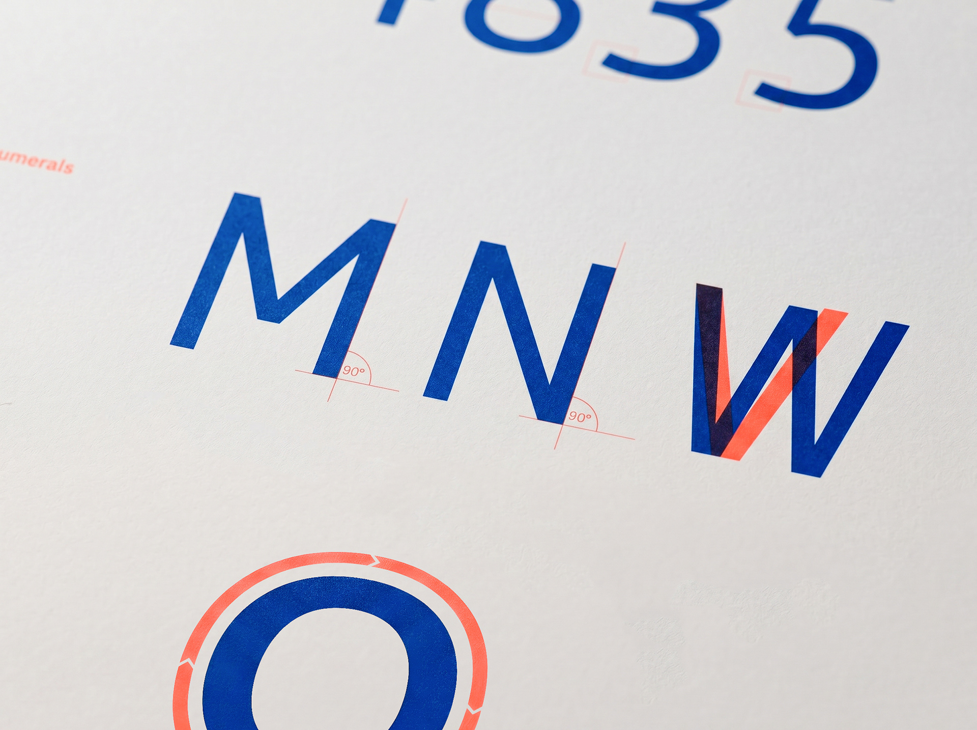
Nokia Pure was born from a pivotal moment in Nokia's evolution, the planned move away from OS Symbian towards MeeGo. The brief was to design a single typeface flexible enough to perform across UI, print, signage, packaging and multiple languages, while embodying the next chapter of the Nokia and Vertu brands.
I was a key collaborator across the whole development process, working alongside agency Saffron and specialist UK type foundry Dalton Maag, and consulting across Nokia's internal departments to stress-test every proposal.
My focus was how the typeface behaved in the real world. I led the graphical implementation, testing where it worked and where it didn't, and looking at how people interact with it on screen, in the operating system and UI, and in print. I fed that back into development to make sure the design represented both the Nokia and Vertu brands. Through workshops and feedback sessions, I also pushed back on the agency to keep the result timeless and able to work across a wide range of media and formats.
Nokia Pure went on to win the Design Museum's Designs of the Year award in the Graphics category.
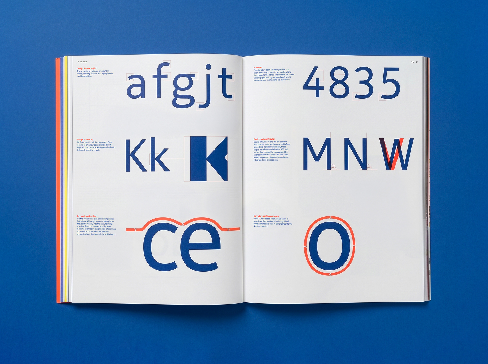
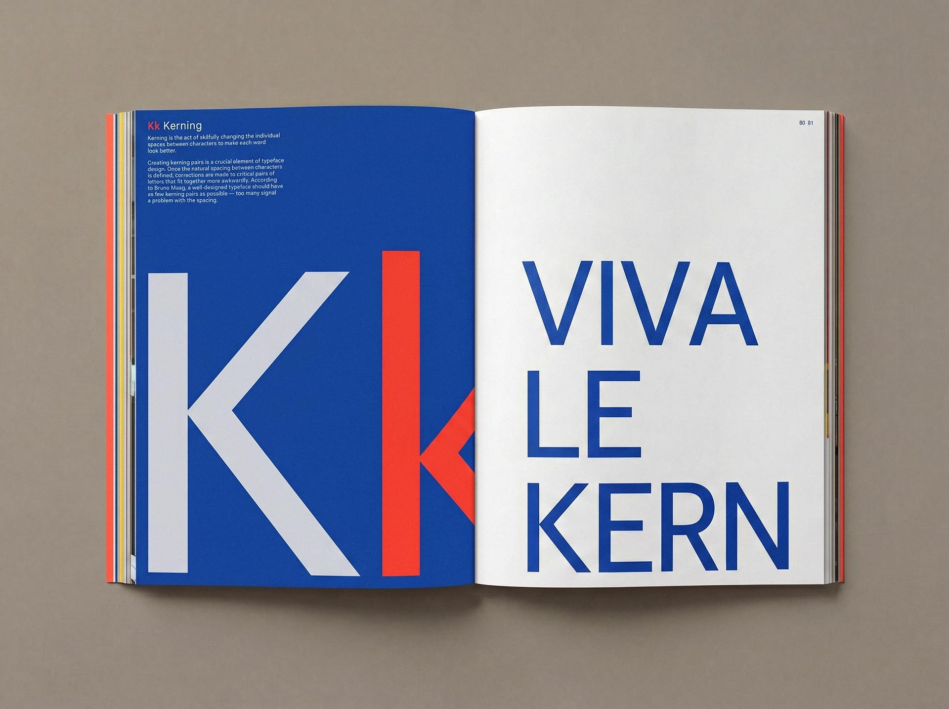
T W E N T Y - S I X C H A R A C T E R S
'A N A L P H A B E T I C A L B O O K A B O U T N O K I A'
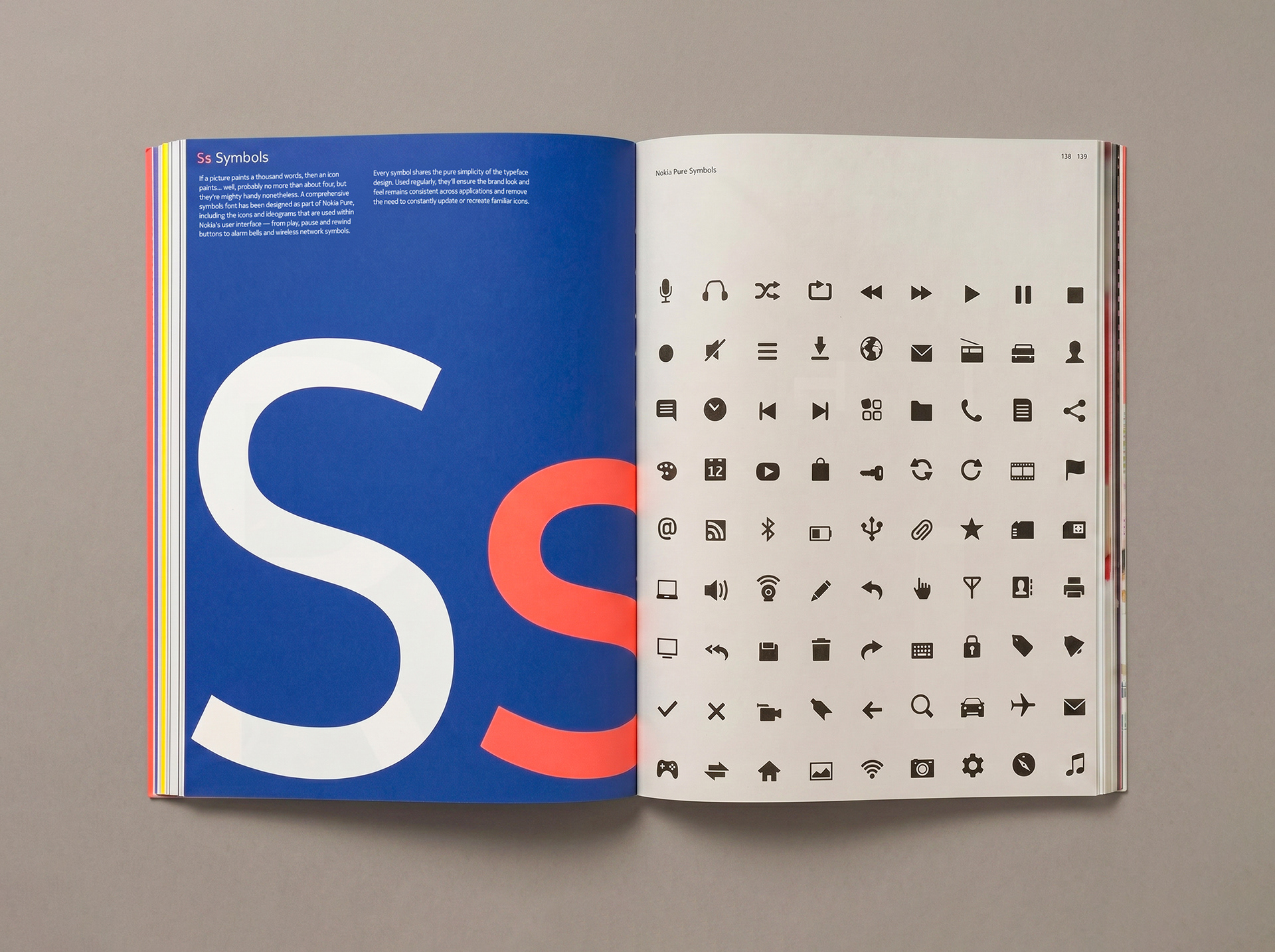
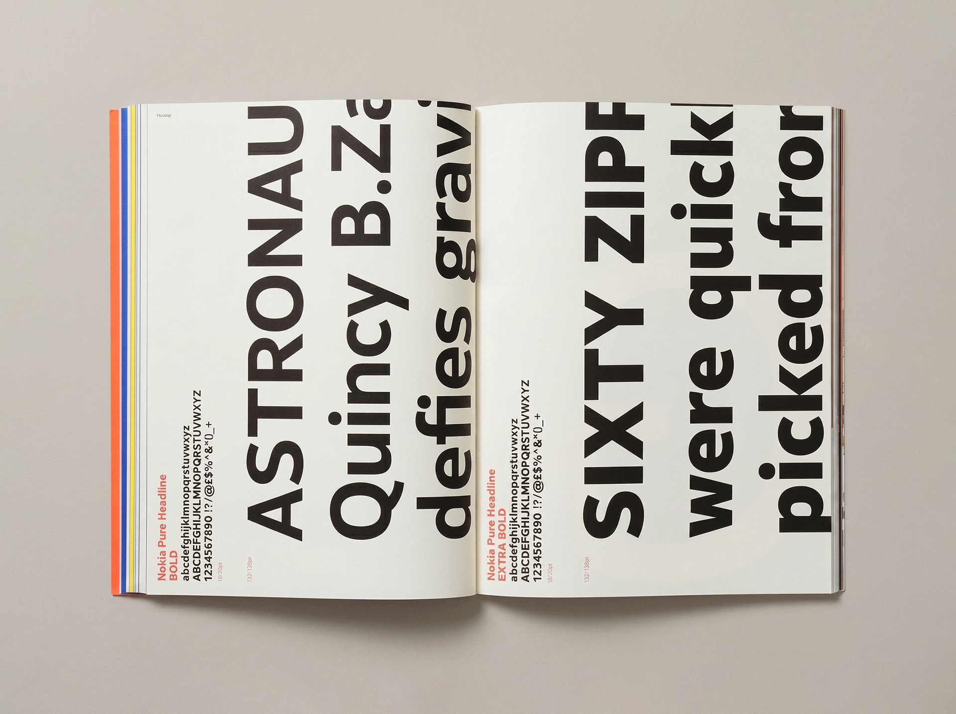
To mark the typeface's creation, Nokia commissioned a limited-edition book documenting its development and showing the full range of what it could do, both as an internal record and as an object to share publicly.
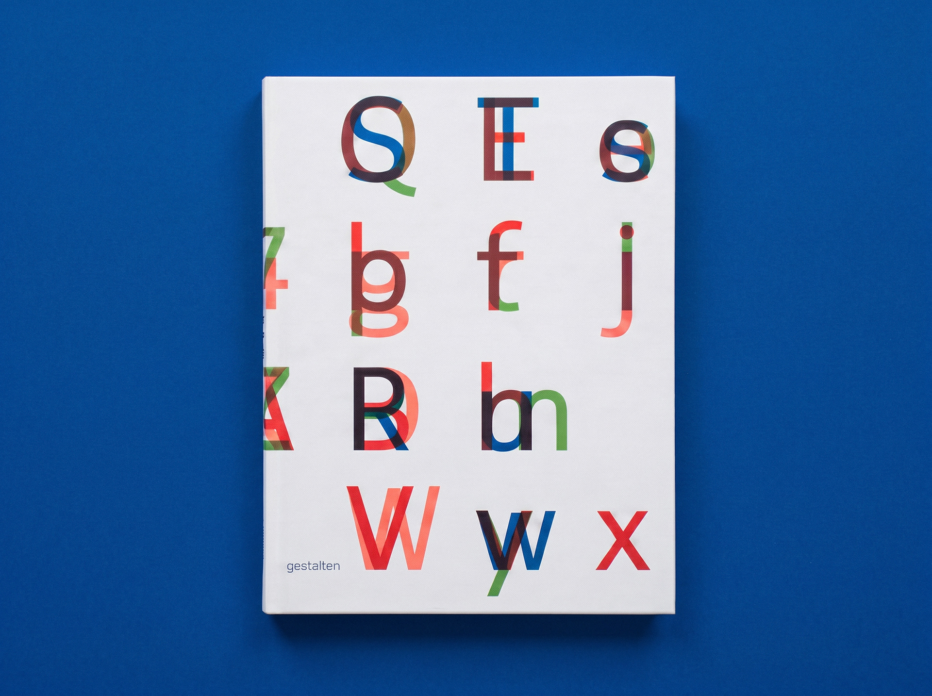
As part of a small, close-knit team, I designed the page layouts and created some of the book's graphics, using Nokia Pure throughout so the typeface itself took centre stage. I also acted as creative advisor between Nokia and the publisher, making sure the brand's vision carried through every decision from typography to production.
Produced in a very limited run, the book is as much a collector's piece as a showcase of what we achieved, and a testament to the design philosophy behind Nokia Pure.